Azure DevOps, previously known as Visual Studio Teams Services (VSTS), is a collaborative environment that supports Agile software development tools for planning, testing and tracking your work in the cloud. Enterprise-wide search is at its core a search engine like Google but searching in a Software as a Service(SaaS). This gives many use cases that includes documents search and access, retrieval and reporting of enterprise data which relies heavily on its search engine.

2015-2018 | AZURE DEVOPS SEARCH
Searchyour own
path
GOAL
Overhaul the search experience
Understanding the User's journey
Ideas, Prototypes and Usability Testing
Conclusion
MY ROLE
I was UX designer for the Search & Socials team of Azure DevOps, Microsoft's cloud offering for planning and tracking software development work. I was working on Search experiences of the platform. I was able to make a big impact by improving the experience's System Usability Score from
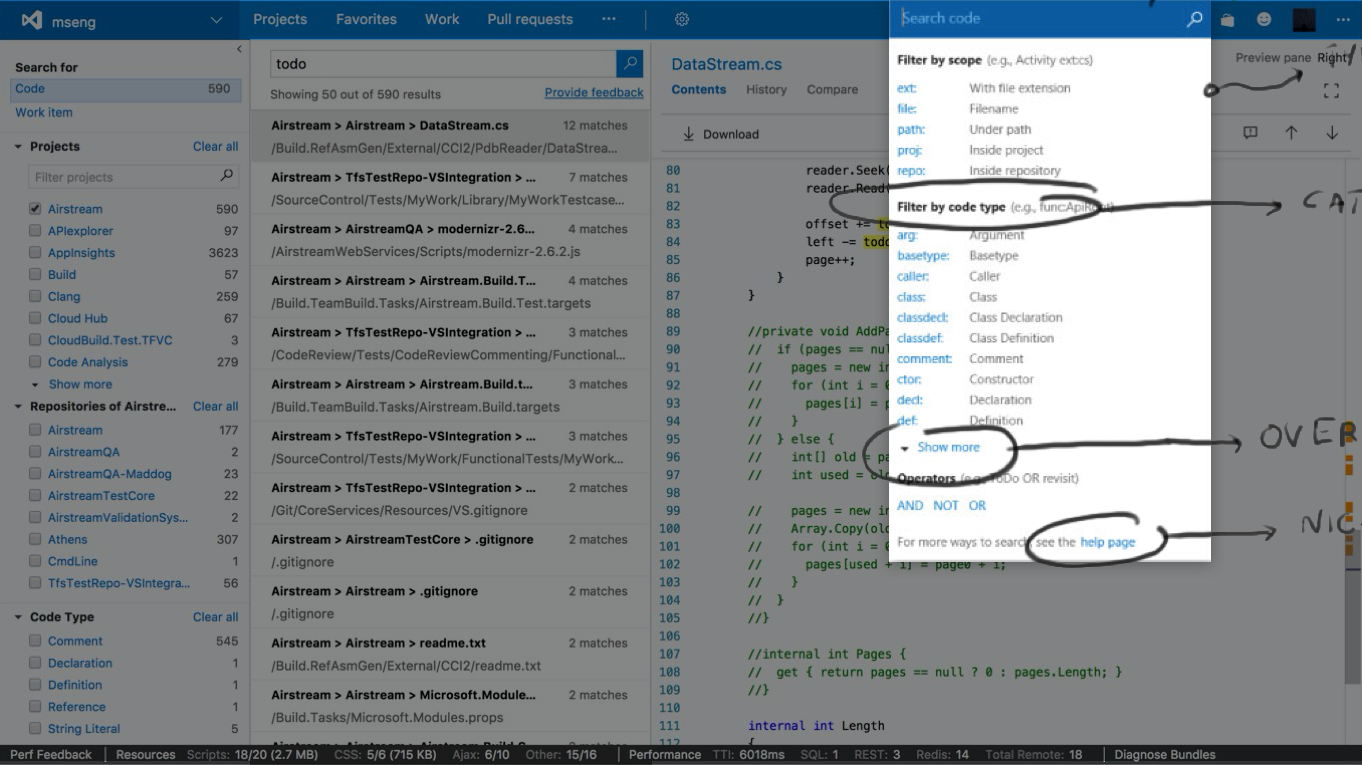
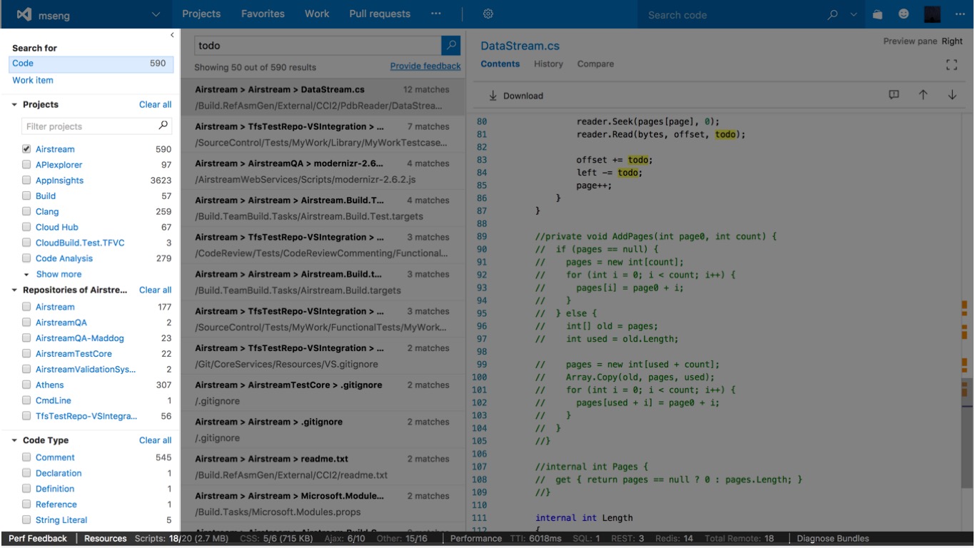
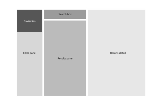
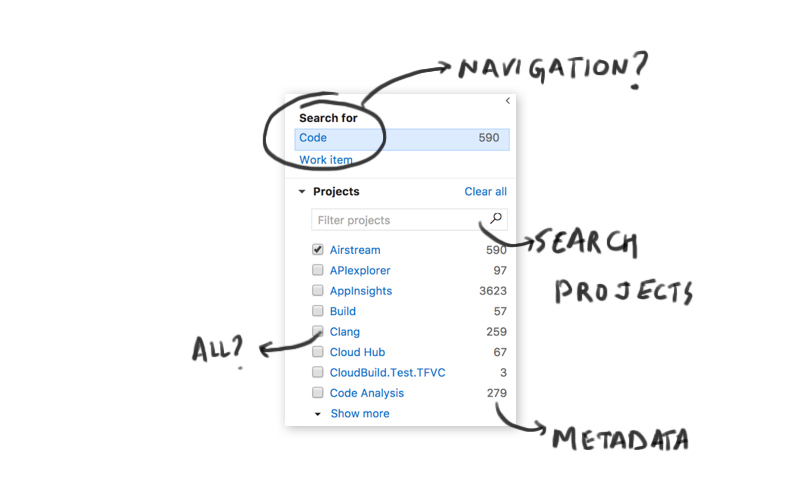
We conducted interviews with internal users to gather their feedback on the existing search experience. The major concerns were on the volume of the results and filtering. After initial user feedback, I tore down the experience into chunks of information which user goes through when he/she is looking for something, there were three main panes in a UI:
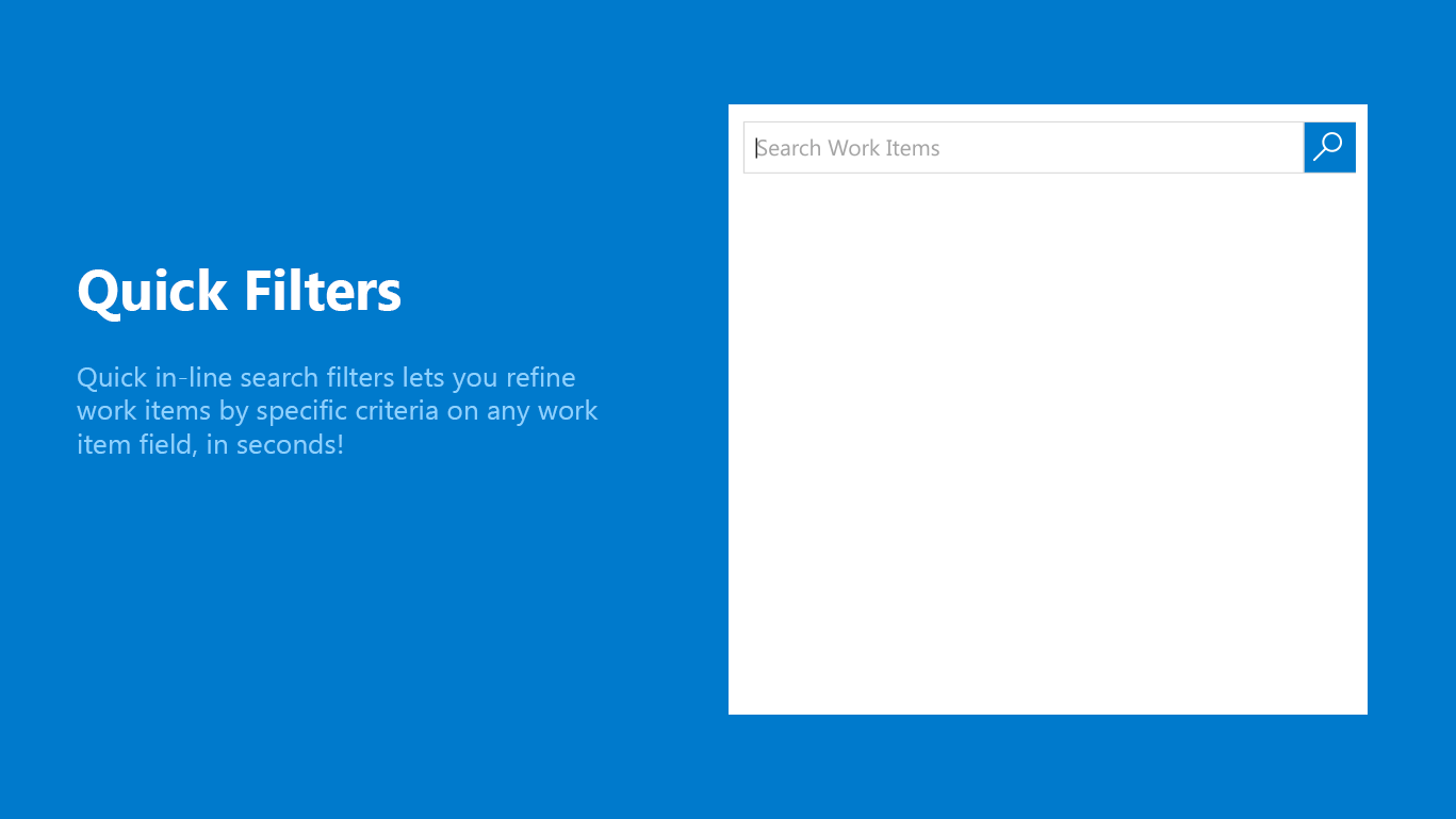
Typeahead Dropdown on Azure DevOps for code search which our users loved.
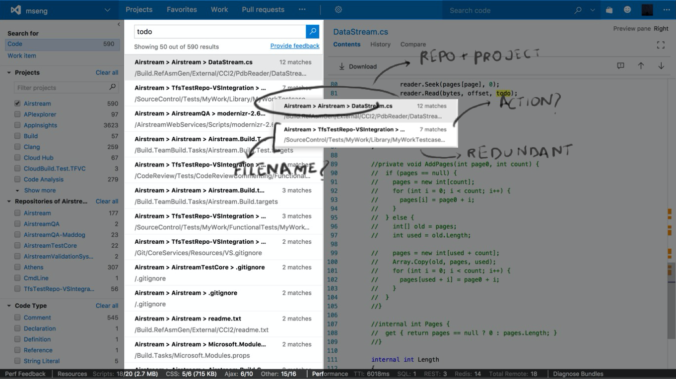
Navigation + Filter: Combining two important aspect of search created cognitive overload
Results pane was cramped up leading to hidden and confusing information
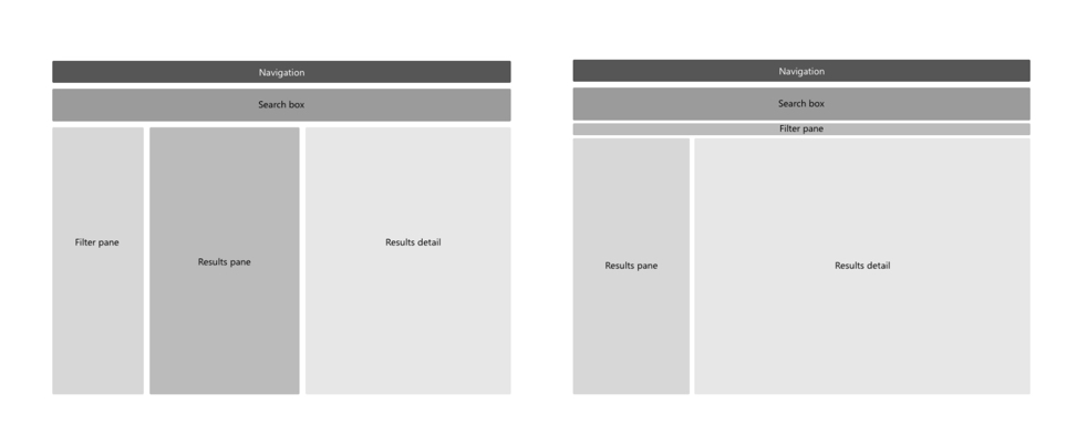
The gaps in above mentioned areas has led to the complex interactions and poor navigation. The hierarchy of the information flow was mismanaged by providing navigation and filters on the same pane. The image below shows the 13000ft view of the search experience, it clearly made the results page into a complex and cramped up UI, where sieving to the required information was difficult.
Both navigation and filter together in a single pane, presented the user with lot of options and confusing hierarchy. Jumping filters was a major concern while changing the search context.
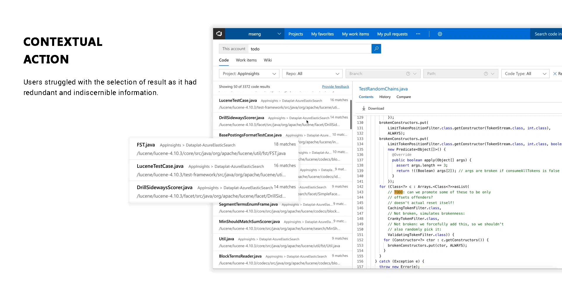
In the Result pane, user also struggled with redundant and indiscernible information. We also tested the current system for its Usability Score, I performed scripting and use case documentation while moderating some of the test along with a User Researcher. The 66 percentile found the system below average.
To simplify the UI we focused on the information flow and went with simplistic approach for searching information. While maintaining the information hierarchy, my focus was keeping the end users always aware of the context.
Initially, we looked at both the above approaches and built low-fidelity mockups to discuss about the pros and cons. First one is common in e-commerce websites and is widely used by the all user, while the second one presents more hierarchical way. After conducting A/B testings and looking patterns in searching for our persona, we were able to narrow down to second approach for overhauling the search experience This method also gave an extra edge by providing search as a query builder, a more popular method to search in advanced users.
The SUS score for overhauled experience went from 66 percentile to 81 percentile which means, the end user will most likely recommend the system to their friends.
EXPLORATIONS
DELIGHTING USERS WHILE THEY WAIT, it is an exploration on Progress indication, it is a code-based approach to animation. The load time at the clients browser will reduce significantly in comparison with traditional .GIF images. While creating these SVG animation, I tried to focus on the intent and context of the user and to showcase its effectiveness I created bunch of simple SVG illustrations based on the pages user visit. In my opinion, the amount of data an enterprise management software handles is huge and lot of the time user end up looking at the blank refreshing pages. For example, A simple task like viewing an object requires end users to build queries in the UI, which takes a long processing time or refreshing. A simple animation with playfulness will help user to calm down and have short breaks amidst work. View more at CodePen